No white-coat clichés
The art direction uses quiet spatial imagery and tactile details, avoiding stock-photo performative care.
A reassuring clinic experience that makes booking, understanding services, and finding the right practitioner feel straightforward.
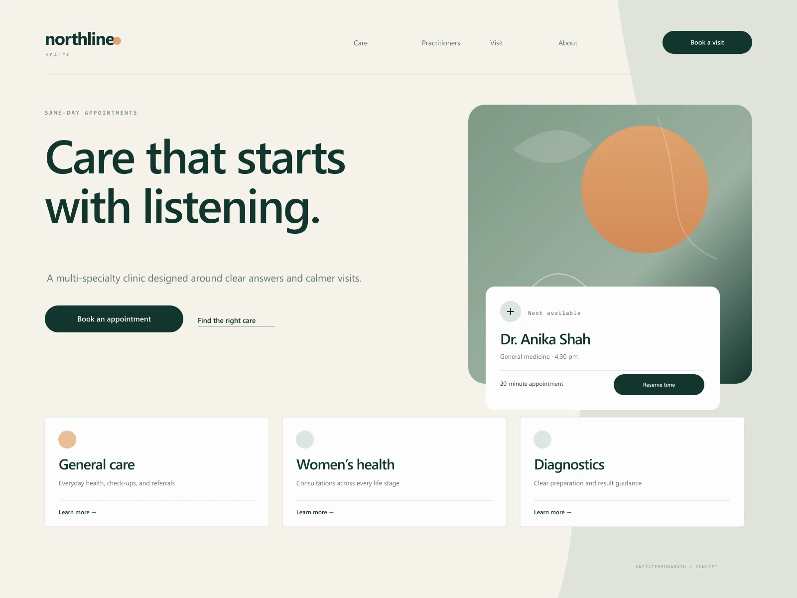
The brief
Northline is a fictional multi-specialty clinic concept. The design explores how a healthcare site can feel warm and human without becoming visually soft or operationally vague. The central journey is simple: understand the care offered, choose the right person, and book with confidence.
Concept goals
Design direction
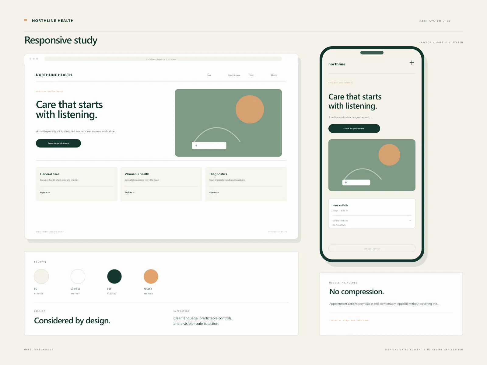
A contemporary care direction built on deep green, sage, and warm bone. The layout is quiet and legible, with generous touch targets, clear appointment status messaging, and a photography system focused on spaces and details rather than generic doctor poses.
Type system
A warm humanist sans for reading, with softly rounded display forms and deliberately plain supporting type.
Audience
Principles
The experience
These are designed flows, not claims of a shipped client product. They demonstrate the decisions we would take into a real build.
Service categories are organised around what a patient may be experiencing, not internal department names alone.
Profiles explain speciality, approach, languages, and availability in a consistent, skimmable format.
A persistent booking route that clearly states what happens next and the clinic's response expectations.
Opening hours, location guidance, accessibility notes, and contact options are written to be usable under stress.
Service pages include preparation notes and appointment expectations without making medical claims beyond the clinic's scope.
Key design decisions
The art direction uses quiet spatial imagery and tactile details, avoiding stock-photo performative care.
A compact appointment panel follows the user across service and practitioner pages, then hands off to a clear, validated form.
Response time, what to bring, and accessibility information sit next to the booking action rather than in a distant FAQ.
Responsive details
The mobile experience was considered alongside desktop, not compressed from it. These are the specific constraints that shaped the concept.
Proposed stack
Concept project disclaimer
This is a self-initiated design study. Any logos, names, people, or business details within the visual are fictional. No revenue, conversion, ranking, or satisfaction outcome is claimed. It exists to show how we approach a particular industry.
Keep looking
 Concept Project
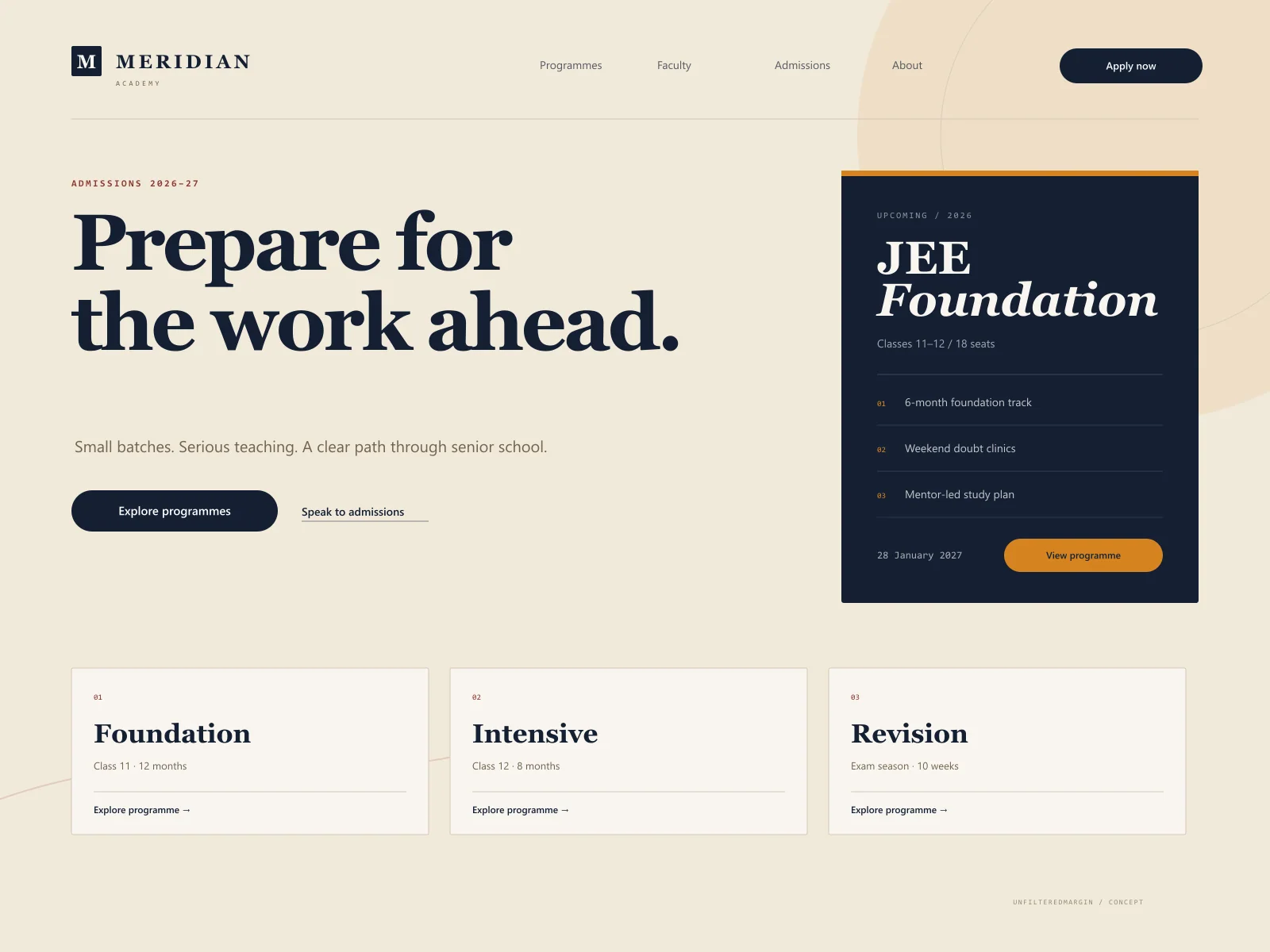
Course discovery and admissions for a coaching institute that needed clarity, not noise.
 Concept Project
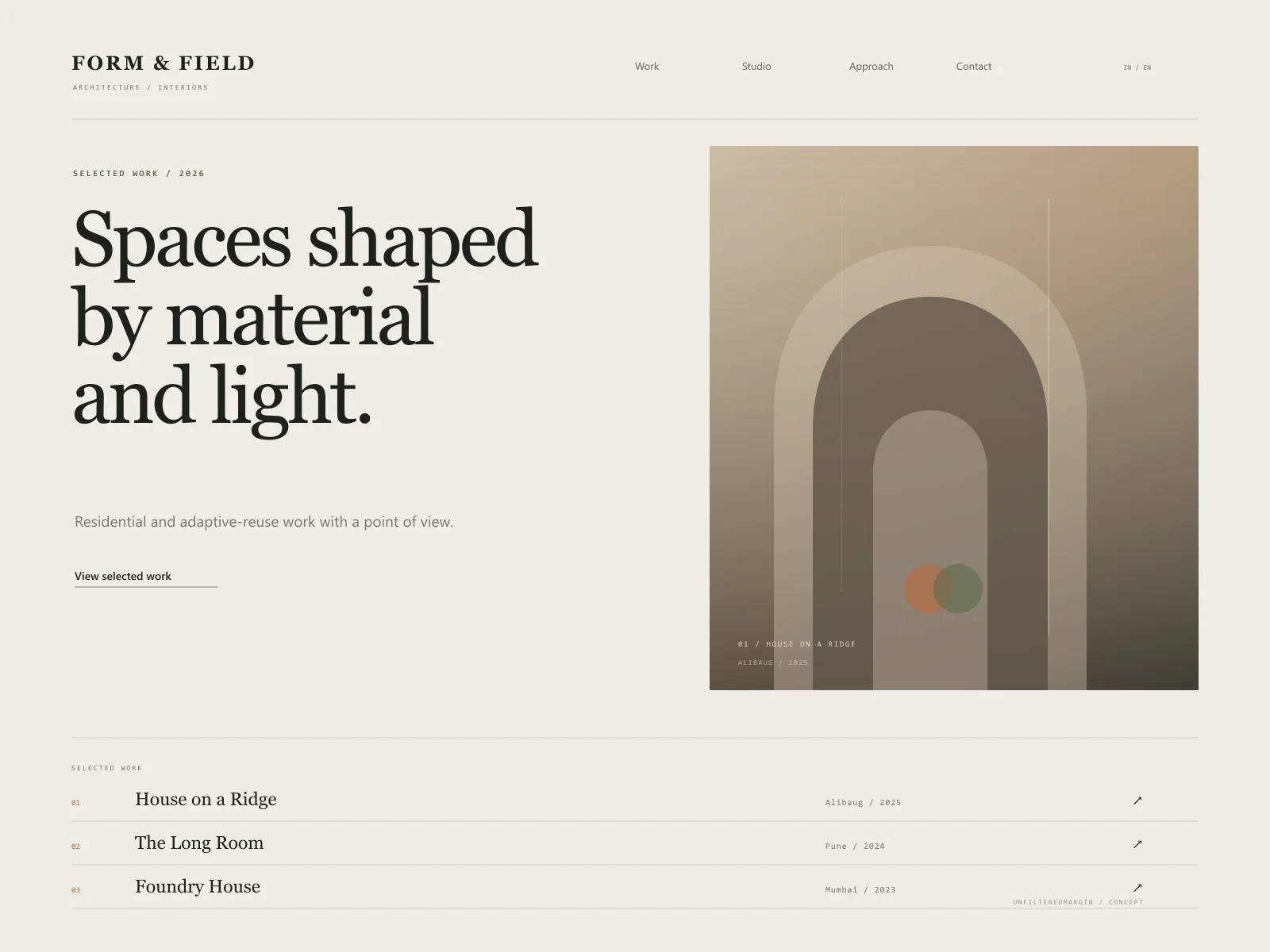
An image-led architecture portfolio with room to think, read, and feel the material.
A similar brief?
Tell us about the industry, the audience, and what is not working today. We will help you identify a scope that earns its place.