A list, not a card wall
The project index uses an editorial listing to establish hierarchy and avoid flattening every project into the same rectangle.
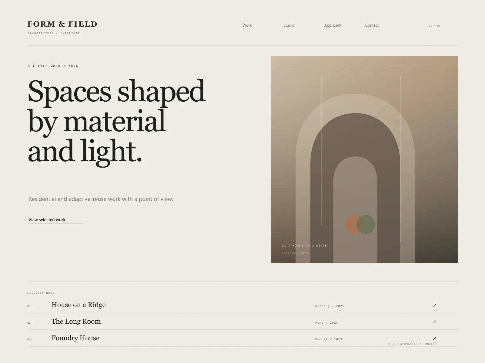
An editorial portfolio for an architecture practice where project imagery, material detail, and considered pacing do the talking.
The brief
Form & Field is a fictional architecture and interiors practice working across residential and adaptive-reuse projects. The concept is built for a studio that values restraint and materiality. Instead of a busy grid, it sequences projects like a printed monograph, giving each one a clear point of view.
Concept goals
Design direction
An architectural monograph in digital form: off-white paper, dense ink, clay and moss accents, strong grid discipline, and a serif that carries a quiet point of view. Project photography is treated as content, not decoration.
Type system
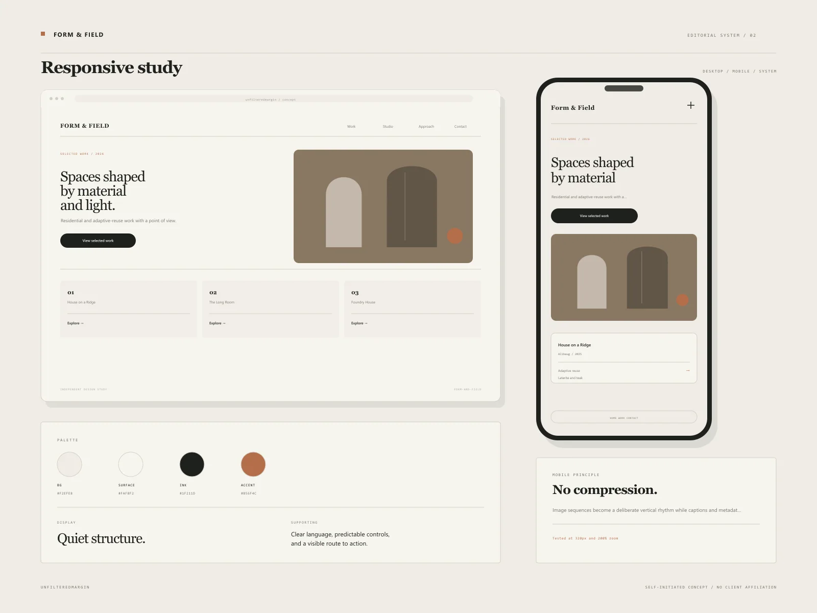
An editorial serif display with compact grotesque captions and monospace project metadata.
Audience
Principles
The experience
These are designed flows, not claims of a shipped client product. They demonstrate the decisions we would take into a real build.
A typographic list of works paired with varied image crops, revealing project type, location, and year.
Each project story combines brief, constraints, material notes, plans, and a controlled image sequence.
Images adapt their crop to screen size while preserving the architectural composition where possible.
A clear statement of values and working method, with an intentionally small set of collaborators rather than an invented corporate team.
A context-rich enquiry form asking for project type, location, stage, and approximate scope.
Key design decisions
The project index uses an editorial listing to establish hierarchy and avoid flattening every project into the same rectangle.
Clay and moss tones echo plaster, timber, and landscape without turning the site into a mood board.
A tighter edit of large, well-cropped images creates more impact than a dense gallery with dozens of thumbnails.
Responsive details
The mobile experience was considered alongside desktop, not compressed from it. These are the specific constraints that shaped the concept.
Proposed stack
Concept project disclaimer
This is a self-initiated design study. Any logos, names, people, or business details within the visual are fictional. No revenue, conversion, ranking, or satisfaction outcome is claimed. It exists to show how we approach a particular industry.
Keep looking
 Concept Project
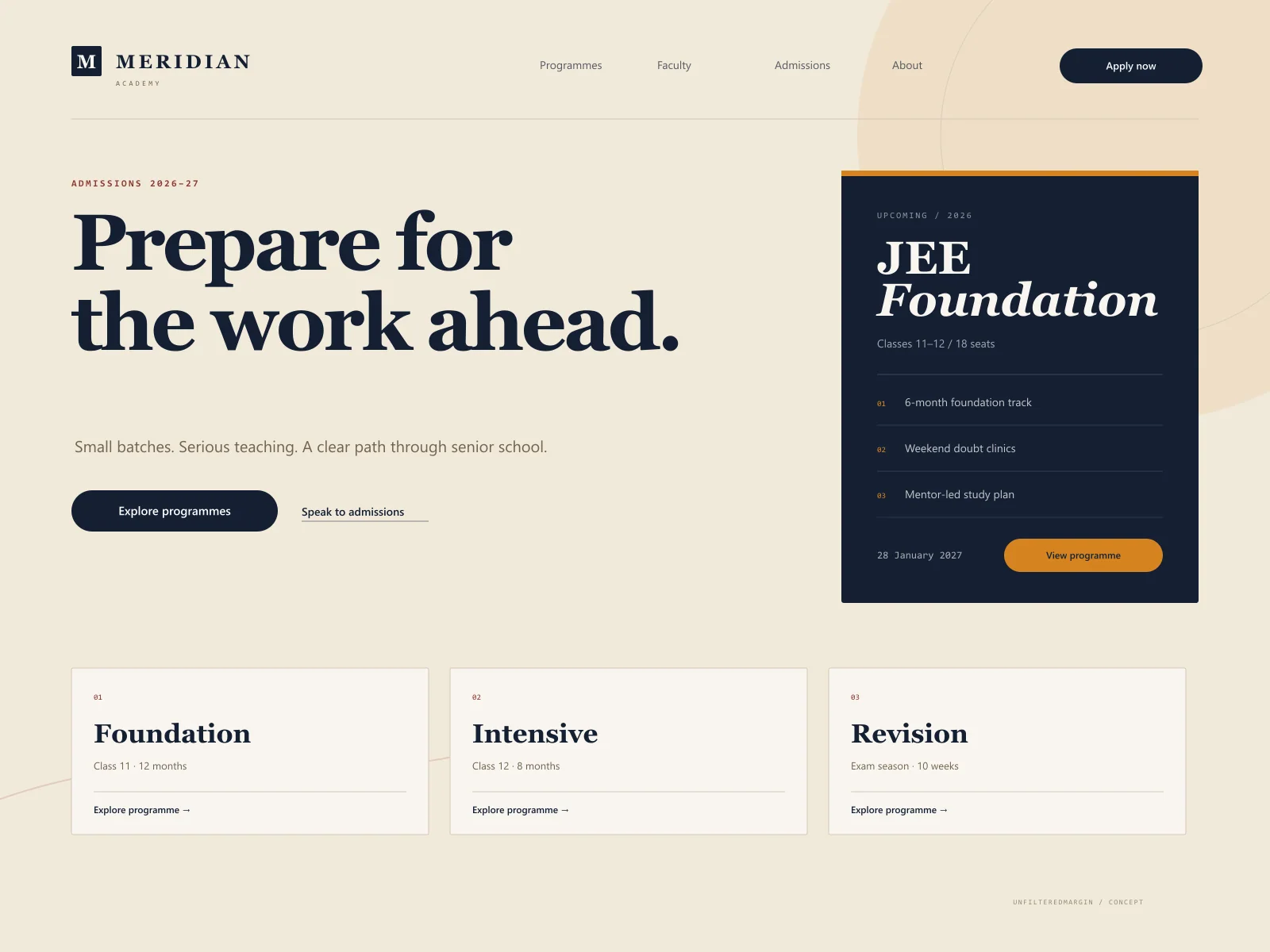
Course discovery and admissions for a coaching institute that needed clarity, not noise.
 Concept Project
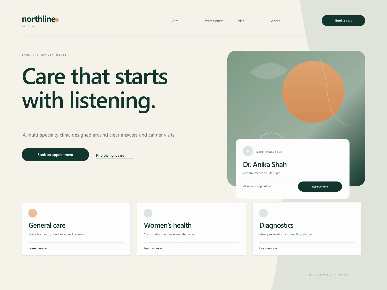
A calmer clinic website with accessible appointment paths and human, jargon-light service information.
A similar brief?
Tell us about the industry, the audience, and what is not working today. We will help you identify a scope that earns its place.