Warmth before urgency
There are no flashing discounts or artificial scarcity patterns. The pace matches the objects.
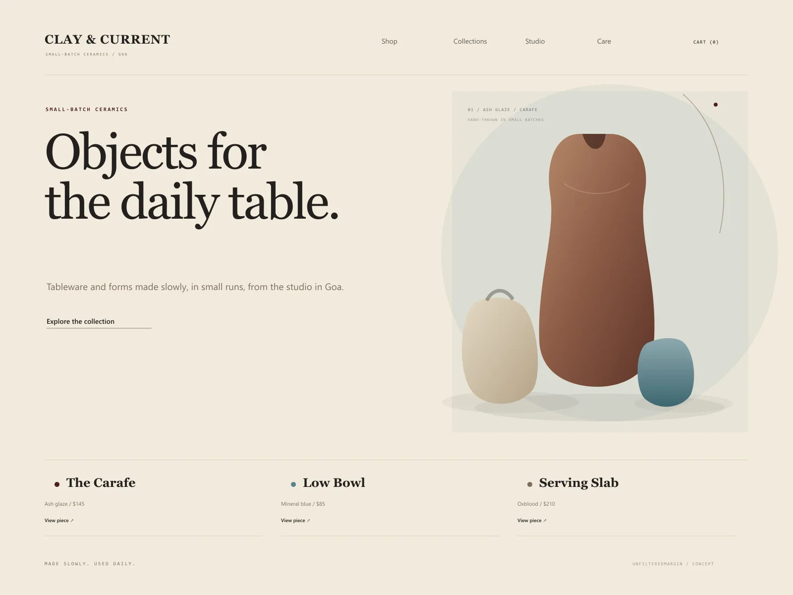
A tactile, unhurried storefront for a small-batch ceramics studio, balancing product discovery with the story behind each object.
The brief
Clay & Current is a fictional ceramics studio selling small-batch tableware and objects. The concept treats an online store as a place to browse with the same unhurried attention as a physical shelf. It balances product facts with material, maker, and care stories, while keeping the route to checkout direct.
Concept goals
Design direction
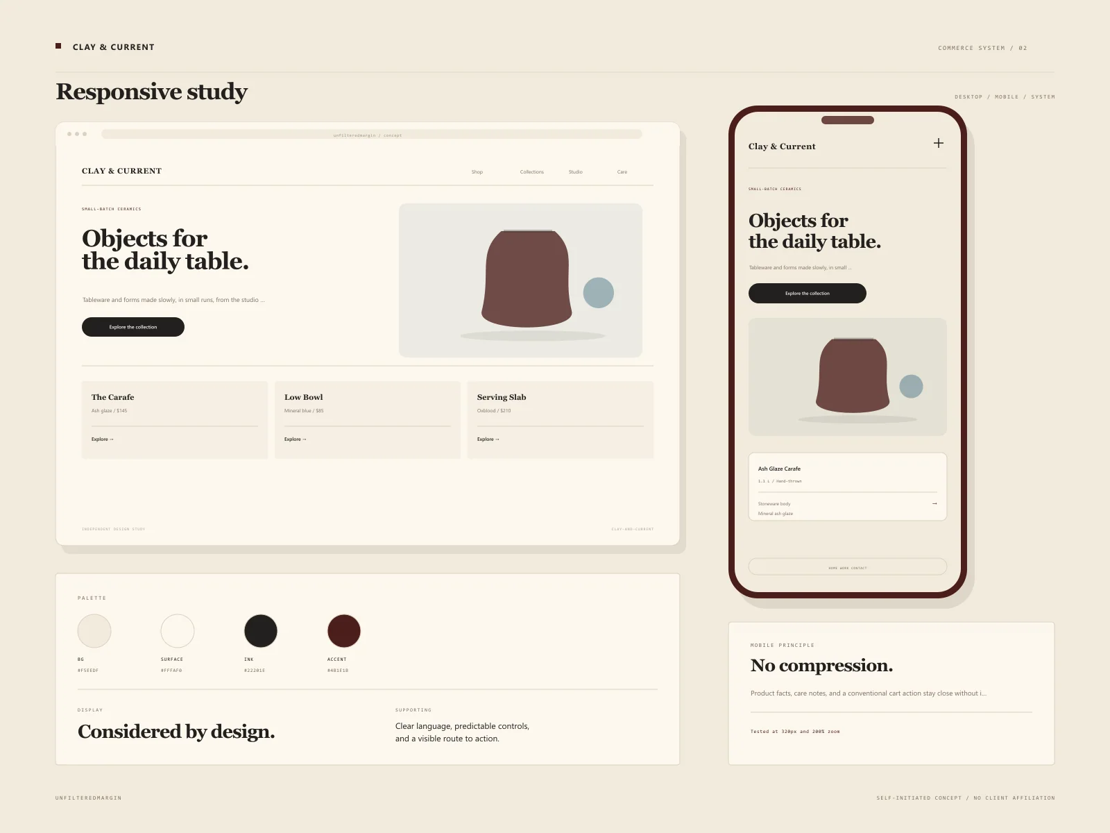
A rich, tactile commerce direction: oxblood, warm cream, and a single mineral blue. Product photography is given large, quiet frames; descriptive type is warm but precise. The checkout path stays extremely conventional where convention helps.
Type system
A sensuous serif for product names paired with a crisp sans for commerce information and prices.
Audience
Principles
The experience
These are designed flows, not claims of a shipped client product. They demonstrate the decisions we would take into a real build.
A calm product index grouped by use and collection, with useful filtering rather than endless scroll.
Dimensions, material, finish, care notes, and shipping expectations alongside variant clarity.
A conventional, legible cart and checkout handoff designed around trusted commerce patterns.
Short studio stories that add context without turning every product page into a manifesto.
Practical answers placed close to purchase, reducing avoidable pre-sale messages and returns.
Key design decisions
There are no flashing discounts or artificial scarcity patterns. The pace matches the objects.
Story and transaction share the page, but never compete: the cart and product details remain structurally clear.
Cart, checkout, and payment patterns stay familiar even while the brand expression is distinctive.
Responsive details
The mobile experience was considered alongside desktop, not compressed from it. These are the specific constraints that shaped the concept.
Proposed stack
Concept project disclaimer
This is a self-initiated design study. Any logos, names, people, or business details within the visual are fictional. No revenue, conversion, ranking, or satisfaction outcome is claimed. It exists to show how we approach a particular industry.
Keep looking
 Concept Project
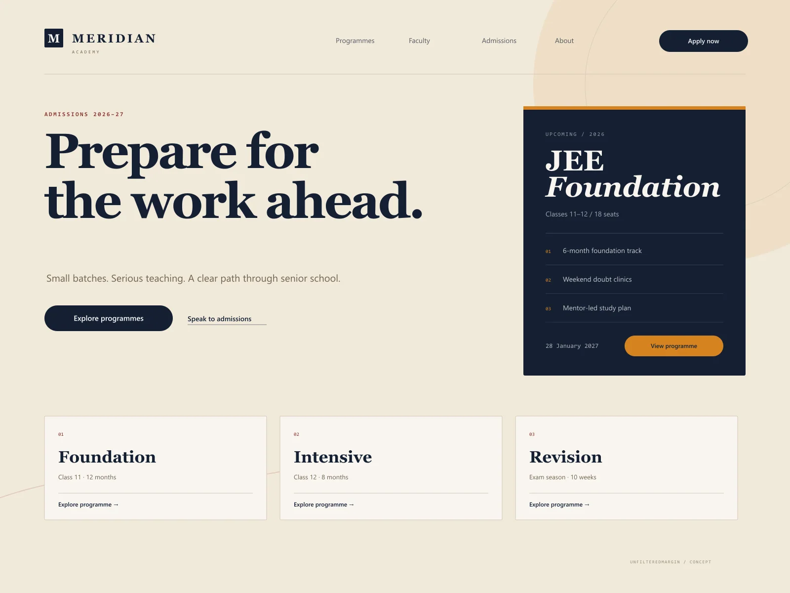
Course discovery and admissions for a coaching institute that needed clarity, not noise.
 Concept Project
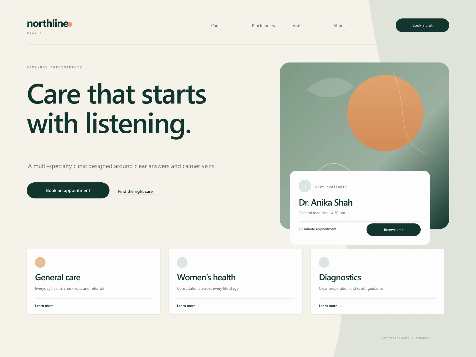
A calmer clinic website with accessible appointment paths and human, jargon-light service information.
A similar brief?
Tell us about the industry, the audience, and what is not working today. We will help you identify a scope that earns its place.